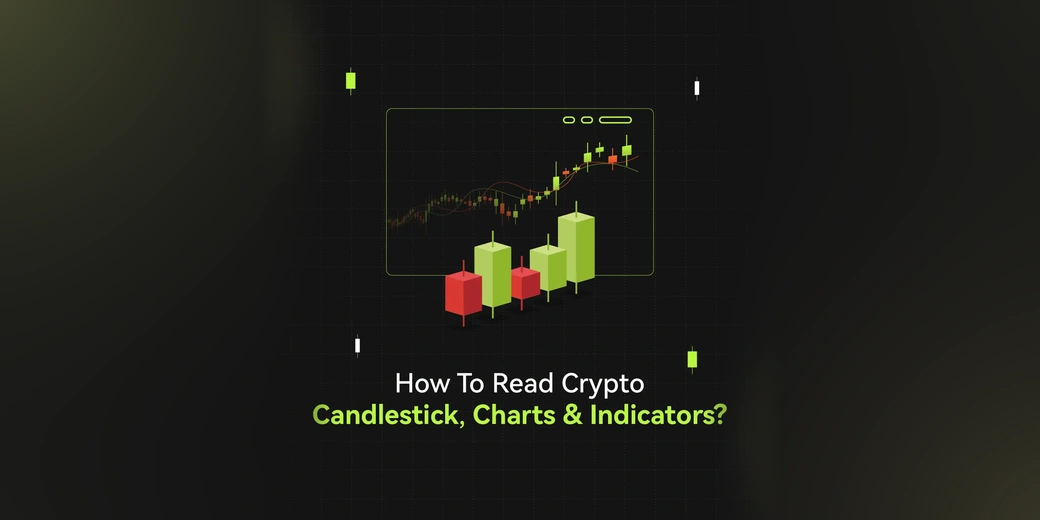
Crypto candlestick charts give traders a compact view of how price moved during a specific period. Each candle records four key prices: the open, high, low, and close (OHLC).
A single candle can show whether buyers or sellers controlled the interval, how far price moved, and whether price closed near the high or low of the range. When several candles are read together, they can help traders identify trends, support and resistance, momentum, and potential reversal or continuation setups.
Candlesticks are most useful when read in context. A hammer near established support means something different from the same candle appearing in the middle of a sideways market. The same applies to technical indicators: RSI, moving averages, MACD, and Bollinger Bands can add context, but none should be treated as a standalone prediction tool.
What Is a Crypto Candlestick Chart?
A crypto candlestick chart visually represents an asset's price movement over a selected period. Unlike a simple line chart, each candlestick preserves four pieces of price information:
Component | What It Shows |
Open | The first traded price during the selected period |
High | The highest traded price during the period |
Low | The lowest traded price during the period |
Close | The final traded price when the period ends |
The candlestick itself has three main visual elements: the real body, the upper wick, and the lower wick.
The vertical axis shows price, while the horizontal axis represents time. Depending on the chart, one candle can represent one minute, five minutes, one hour, four hours, one day, or another interval.

OHLC data and candlestick anatomy show how price moved within a selected trading period.
Crypto markets trade 24/7, so the meaning of an "open" and "close" depends on the selected timeframe and the chart's data feed. There isn't a daily market open and close in the same sense as a traditional stock exchange.
How Is a Crypto Candlestick Formed?
A candlestick is built from executed trades during its selected timeframe.
For example, assume a 1-hour BTC/USDT candle records:
Open: $100,000
High: $101,200
Low: $99,400
Close: $100,800
The candle therefore shows that Bitcoin started the hour at $100,000, traded as high as $101,200, fell as low as $99,400, and finished at $100,800.
The body spans the open and close. The wicks extend from the body to the high and low.
This distinction matters because a candle's body doesn't tell the whole story. A candle can have a small body while covering a wide price range during the interval.
How to Read a Crypto Candlestick

Five steps for reading a crypto candlestick and putting its price action into context.
Reading a candle doesn't require memorizing dozens of patterns. Start with the timeframe, then identify the open and close, inspect the body and wicks, and finally compare the candle with what happened before it.
Check the Timeframe

The timeframe tells you how much price action each candle represents.
A 5-minute candle records five minutes of trading activity. A 4-hour candle compresses four hours into one bar, while a daily candle represents an entire 24-hour period.
The same candle shape can have very different significance across timeframes. A long wick on a 5-minute chart may reflect a brief price spike, while a similar wick on a daily chart represents a much larger period of market activity.
Before interpreting a candle, always ask:
What timeframe am I looking at?
Is the candle still forming?
How does the current candle compare with nearby candles?
Find the Open and Close
The relationship between the open and close determines whether a candle is bullish or bearish under the chart's default color convention.
A green candle therefore doesn't necessarily mean price is higher than the previous candle's close. It only means that the current candle closed above its own opening price.
For example, if BTC opens at $100,000 and closes at $100,500, the candle is bullish. But if the previous candle closed at $101,000, BTC still finished the current period below the previous close.
Read the Real Body
The body represents the distance between the opening and closing prices.
A relatively large body means price finished far from where the interval began. A small body means the open and close were relatively close.
Large bullish bodies can occur when buyers push price higher during the interval. Large bearish bodies can occur when sellers drive price lower.
The body should still be compared with surrounding candles. A $500 move may be significant on one asset or timeframe and almost irrelevant on another.
Read the Wicks or Shadows
The upper and lower wicks show the highest and lowest prices reached during the timeframe.
A long upper wick tells you that price traded substantially above the body's open-close area before moving back down. A long lower wick shows that price traded substantially below the body before recovering.
It's tempting to call every long wick "rejection," but the candle itself doesn't tell you why price moved. Long wicks can appear during liquidations, sudden news, thin liquidity, or sharp order-flow changes.
The wick shows what price did. Context helps explain what may have caused it.
Compare the Candle With Surrounding Price Action
An isolated candle rarely provides enough information for a complete trading setup.
Look at:
Trend: Is price making higher highs and higher lows, lower highs and lower lows, or moving sideways?
Location: Is the candle forming near support, resistance, a previous high, or a previous low?
Volume: Is the move accompanied by unusually high or low trading activity?
Follow-through: Does the next candle support or invalidate the original interpretation?
This contextual approach is more useful than assigning a fixed meaning to every candle shape.
Understanding Bullish and Bearish Candles
A bullish candle closes above its opening price, while a bearish candle closes below it.
Bullish Candles
Bullish candles indicate that the closing price was higher than the opening price for the selected period.
A large bullish body can show strong directional movement during that interval. Several bullish candles appearing together can also indicate sustained upward price action.
The interpretation still depends on location. A large bullish candle breaking above resistance can mean something different from a large bullish candle that occurs after an extended rally and immediately runs into resistance.
Bearish Candles
Bearish candles close below their opening price.
A large bearish body can show strong downward movement during the interval. Several consecutive bearish candles may indicate sustained selling pressure.
Again, context matters. A bearish candle at resistance may be interpreted differently from an identical candle in the middle of an established downtrend.
How Crypto Candlestick Timeframes Work
Crypto traders can analyze the same market across multiple timeframes.
Timeframe | Typical Use |
1m-5m | Very short-term price action |
15m-1H | Intraday analysis |
4H | Short- to medium-term market structure |
1D | Broader trend analysis |
1W | Long-term market structure |
These aren't strict categories. A trader can use a daily chart to establish the broader trend and a 15-minute chart to study a shorter-term setup.
Why the Same Candle Looks Different Across Timeframes
A higher-timeframe candle is built from multiple lower-timeframe candles.
For example, one 1-hour candle contains four 15-minute candles. The 1-hour candle takes:
The open from the first 15-minute candle.
The close from the final 15-minute candle.
The highest high across all four candles.
The lowest low across all four candles.
This means a bullish 1-hour candle can contain both sharp rallies and sell-offs on a 15-minute chart.
Live Candles vs. Closed Candles

A live candle can change until the selected timeframe closes, while a closed candle has fixed OHLC data.
A candle that is still forming can change significantly before the timeframe ends.
Its:
This is especially important for candlestick patterns. A candle that looks like a hammer halfway through the timeframe may no longer look like a hammer when it closes.
For that reason, traders often wait for a candle to close before treating a pattern as confirmed.
A closed candle doesn't guarantee that the pattern will work. It simply means you're analyzing final OHLC data for that interval rather than an unfinished candle.
How to Read Candlesticks in Context

Candlestick signals are easier to interpret when viewed with trend, support, resistance, and volume.
Candlestick analysis becomes more useful when three questions are answered first:
Where is price? What has price been doing? What is happening around the current level?
Trend
An uptrend is generally characterized by higher highs and higher lows. A downtrend tends to produce lower highs and lower lows. A sideways market moves within a relatively defined range without sustained directional structure.
A bullish candlestick inside an established uptrend can be a continuation signal, while the same candle after a prolonged decline may be part of a potential reversal.
The candle shape hasn't changed. The context has.
Support and Resistance
Support and resistance provide important reference points for candlestick analysis.
A bullish reversal pattern near established support can be more meaningful than the same pattern appearing in the middle of a range.
Likewise, a bearish pattern near resistance deserves more attention than one appearing randomly during a strong trend.
Support and resistance should be treated as areas rather than perfectly precise prices. Crypto markets can trade through a level briefly before reversing.
Trading Volume
Volume shows how much trading activity occurred during a period.
A price breakout accompanied by increased volume may provide stronger confirmation than a similar breakout occurring on unusually low volume.
Volume can also help distinguish between a large candle with broad market participation and a move occurring in a relatively thin market.
Volume isn't proof that a breakout will continue. It is one additional piece of evidence.
Common Crypto Candlestick Patterns

A quick reference to common crypto candlestick patterns and their basic structures.
Candlestick patterns are recurring combinations of price bars. They can help traders describe potential continuation or reversal setups, but no individual pattern guarantees the next market move.
Doji
A Doji forms when the open and close are very close together.
The body is small, but the wicks can still be long.
A Doji often reflects a period where neither buyers nor sellers managed to create much net movement between the open and close.
Its meaning depends heavily on context. A Doji after a sustained trend can attract attention, while one inside a choppy range may provide little additional information.
Hammer
A hammer has a relatively small body and a long lower wick, with little or no upper wick.
It is commonly studied after a decline because the long lower wick shows that price moved significantly lower before recovering toward the open-close area.
A hammer near support can be worth monitoring for a potential reversal setup.
The candle alone isn't confirmation. Traders may wait for the next candle to hold above the hammer's range or for another form of price confirmation.
Shooting Star
A shooting star has a small body near the lower part of the candle's range and a relatively long upper wick.
It commonly attracts attention after an uptrend because price moved substantially higher during the interval but failed to hold those highs.
A shooting star near resistance can provide a warning that upward momentum may be weakening, but follow-through is still needed before treating it as a confirmed reversal.

Doji, Hammer, and Shooting Star patterns can provide clues about indecision or price rejection.
Bullish Engulfing
A bullish engulfing pattern typically consists of a bearish candle followed by a larger bullish candle whose body covers the previous candle's body.
The pattern can indicate a shift in short-term buying pressure.
Location matters. A bullish engulfing pattern near support after a decline has a different context from one appearing during an already extended uptrend.
Bearish Engulfing
A bearish engulfing pattern is the opposite structure.
A bullish candle is followed by a larger bearish candle whose body covers the previous candle's body.
The pattern can indicate increasing selling pressure, particularly when it forms near resistance or after an extended rise.

Bullish and Bearish Engulfing patterns compare the current candle body with the previous candle body.
Morning Star
A Morning Star is a three-candle bullish reversal pattern generally associated with a downtrend.
It typically consists of:
A large bearish candle.
A smaller middle candle showing reduced directional movement.
A bullish candle that moves back into the first candle's range.
The pattern suggests that selling momentum may be weakening and buyers may be gaining control.
Evening Star
An Evening Star is the bearish counterpart to the Morning Star.
It generally appears after an uptrend and consists of:
A large bullish candle.
A smaller middle candle.
A bearish candle that moves back into the first candle's range.
Like other candlestick formations, the pattern is more informative when supported by location, volume, and subsequent price action.

Four three-candle patterns displayed in a 2-by-2 layout: Morning Star, Evening Star, Three White Soldiers, and Three Black Crows.
Three White Soldiers
Three White Soldiers is a bullish continuation or reversal pattern generally associated with a sustained upward move. It typically consists of:
Three consecutive bullish candles.
Each candle opens within or near the previous candle's real body.
Each candle closes higher than the previous one, with relatively small upper wicks.
The pattern suggests that buying momentum is strengthening and buyers may be maintaining control of the market.
Three Black Crows
Three Black Crows is a bearish continuation or reversal pattern generally associated with a sustained downward move. It typically consists of:
Three consecutive bearish candles.
Each candle opens within or near the previous candle's real body.
Each candle closes lower than the previous one, with relatively small lower wicks.
The pattern suggests that selling momentum is strengthening and sellers may be maintaining control of the market.
Like other candlestick formations, both patterns are more informative when supported by their location, volume, and subsequent price action.
How to Confirm a Candlestick Pattern
A candlestick pattern should be treated as a setup for further analysis rather than a guaranteed signal.

Candlestick patterns can be evaluated with price context, volume, and follow-through confirmation.
A practical confirmation process can include:
Check the Market Trend
Ask whether the pattern agrees with or challenges the broader trend.
Check Support and Resistance
Look for important price levels around the pattern.
Check Volume
Compare the current volume with nearby candles to see whether participation has changed.
Wait for Follow-Through
A subsequent candle can confirm or weaken the original pattern.
Check Another Timeframe
A pattern on a lower timeframe may look different when viewed against a higher-timeframe trend.
This process can help reduce false positives, but it can't eliminate trading risk.
Best Technical Indicators to Combine With Candlestick Patterns

Technical indicators add trend, momentum, volatility, and volume context to candlestick analysis.
Candlesticks describe price action. Technical indicators can add information about momentum, trend, or volatility.
The goal isn't to put as many indicators as possible on a chart. Each tool should answer a different question.
Relative Strength Index (RSI)
RSI measures the magnitude of recent price changes and is commonly used to assess momentum.
The standard RSI scale runs from 0 to 100. Readings above 70 are often described as overbought, while readings below 30 are often described as oversold.
These levels don't automatically mean that price must reverse. An asset can remain overbought or oversold while a strong trend continues.
Moving Averages
Moving averages smooth price data and can make the broader trend easier to see.
Two common types are:
Simple Moving Average (SMA): Calculates the average price over a selected number of periods.
Exponential Moving Average (EMA): Gives greater weight to recent prices and generally responds faster to new price movements.
Moving averages can provide trend context alongside candlestick patterns.
Bollinger Bands
Bollinger Bands combine a moving average with upper and lower bands based on standard deviation.
The bands expand as volatility increases and contract as volatility decreases.
A common setup uses a 20-period moving average and two standard deviations.
Price touching the upper or lower band shouldn't automatically be treated as a reversal signal. In a strong trend, price can continue moving along an outer band.
Bollinger Bands can instead help traders identify volatility contraction, expansion, and price position relative to recent volatility.
Moving Average Convergence Divergence (MACD)
MACD compares two exponential moving averages to assess momentum and trend changes.
The commonly used configuration uses a 12-period EMA, a 26-period EMA, and a 9-period signal line.
A MACD crossover can provide momentum information, but it shouldn't be treated as a guaranteed buy or sell signal.
On-Balance Volume (OBV)
OBV combines price direction with volume to track changes in cumulative buying and selling pressure.
Traders may compare OBV with price to look for confirmation or divergence.
For example, if price reaches a new high while OBV fails to make a corresponding high, the divergence may deserve further investigation.
OBV is best used as supporting evidence rather than a standalone forecasting tool.
Candlestick Patterns vs. Technical Indicators
Candlesticks and indicators answer different questions.
Tool | Main Question |
Candlesticks | What did price do during the period? |
RSI | How strong has recent price momentum been? |
Moving Average | What is the broader price direction? |
Bollinger Bands | How is price behaving relative to recent volatility? |
MACD | How is momentum changing? |
OBV | Is volume supporting the price movement? |
This makes combining tools useful when each tool contributes distinct information.
For example, a trader might identify a bullish candlestick pattern near support, check whether the broader trend supports the setup, and then use volume or RSI as additional confirmation.
More indicators don't automatically mean better analysis.
How to Apply Technical Indicators on Bitunix Trading Chart
Bitunix charts allow traders to add technical indicators directly to a selected trading pair.
To start, select the trading pair you want to analyze. For example, you can open the BTC/USDT chart and select the Indicators option.

From the indicator list, select the tools you want to monitor. In the original example, RSI and SMA are applied to BTC/USDT.
You can also use the multi-chart layout to compare different views of the same market.

A practical workflow is to use a higher timeframe to establish the broader market structure and a lower timeframe to examine the specific candlestick setup.
How to Monitor Candlestick and Indicator Signals With Crypto Alerts
Crypto markets trade around the clock, so manually watching a chart isn't always practical.
Price and indicator alerts can help traders monitor predefined conditions without keeping a chart open continuously.
For example, you could set an alert around:
Price reaching a support or resistance area.
A candlestick setup forming near a predefined level.
RSI reaching a selected threshold.
Price crossing a moving average.
Bollinger Bands expanding after a period of contraction.
The alert should be treated as a notification to review the chart, not an automatic trading instruction.
Bitunix Super Alert is designed for monitoring predefined market conditions and can be used alongside technical analysis workflows. See the Bitunix Super Alert guide for the current alert features and supported conditions.
Common Mistakes When Reading Crypto Candlesticks
Learning candlestick patterns is relatively easy. Applying them without context is where many mistakes begin.
Treating Every Pattern as a Signal
A hammer doesn't guarantee a rally, and an engulfing pattern doesn't guarantee a reversal.
Patterns are observations about price structure, not promises about future price direction.
Ignoring the Timeframe
A pattern on a 5-minute chart can disappear completely when viewed on a daily chart.
Always identify the timeframe before interpreting the candle.
Reading an Unfinished Candle
A live candle can change shape before it closes.
Waiting for the timeframe to finish can prevent traders from treating a temporary wick or body as a completed pattern.
Ignoring Volume
Price can break through a level on relatively low activity and quickly return.
Volume isn't a perfect confirmation tool, but ignoring it removes useful information from the analysis.
Using Too Many Indicators
A chart covered with RSI, MACD, multiple moving averages, Bollinger Bands, stochastic oscillators, and other tools can make analysis harder rather than easier.
Choose indicators that answer different questions.
Confusing a Candle's Color With Its Overall Price Change
A green candle means the close is above the open.
It doesn't mean the asset is necessarily above the previous candle's close.
Ignoring the Trading Venue
Crypto doesn't have one universal price feed.
BTC/USDT spot, BTC/USD spot, and BTC perpetual futures can produce different candles because they represent different markets.
If a chart looks unusual, check the exchange, trading pair, market type, and price source before interpreting the pattern.
A Simple Crypto Candlestick Analysis Workflow
For beginners, a repeatable process is often more useful than memorizing dozens of patterns.
Step 1: Identify the Market
Check the asset, trading pair, exchange, and whether the chart represents spot or futures.
Step 2: Choose the Timeframe
Start with a timeframe that matches your trading horizon.
Step 3: Identify the Trend
Look for higher highs and higher lows, lower highs and lower lows, or a range.
Step 4: Mark Key Levels
Identify nearby support, resistance, previous highs, and previous lows.
Step 5: Read the Candle
Check the open, close, body size, high, low, and wick structure.
Step 6: Look for a Pattern
Only after understanding the context should you classify the candle as a Doji, Hammer, Engulfing pattern, Morning Star, or another formation.
Step 7: Seek Confirmation
Check volume, momentum indicators, another timeframe, or subsequent price action.
Step 8: Define Risk
Before entering a trade, determine the level at which the setup would no longer be valid and size the position accordingly.
Step 9: Set an Alert
If the setup depends on a future price or indicator condition, use a crypto price or technical alert instead of relying entirely on manual chart monitoring.
Crypto Candlestick Reading Checklist
Before acting on a candlestick setup, ask:
Is this the correct trading pair and exchange?
What timeframe am I looking at?
Has the candle closed?
What are the open, high, low, and close?
How large is the body compared with recent candles?
Are the upper or lower wicks unusually long?
What is the broader trend?
Is price near support or resistance?
What does volume show?
Does another indicator or timeframe support the interpretation?
What would invalidate the setup?
This checklist keeps the analysis focused on evidence rather than pattern names.
Conclusion
Crypto candlestick charts turn continuous price activity into a format that is easier to analyze. Each candle records the open, high, low, and close, while the body and wicks show how price moved within the selected timeframe.
The real value comes from reading candles in context. Start with the timeframe and market structure, identify support and resistance, inspect the candle's body and wicks, then check volume and subsequent price action before interpreting a pattern.
Technical indicators can add another layer of information. RSI can provide momentum context, moving averages can help identify trends, Bollinger Bands can show volatility, MACD can track momentum changes, and OBV can help compare price with volume.
No candlestick pattern or indicator can eliminate uncertainty from crypto trading. A consistent analysis process, clear invalidation levels, appropriate position sizing, and disciplined risk management matter more than memorizing a long list of candle names.